REBOUND PHYSICAL THERAPY
WEBSITE REDESIGN
When a Website Finally Matches the Heart of a Business

There are few things more satisfying as a designer than helping a business that has spent twenty years earning trust finally look the part online.
When Melissa and Joe, co-owners of Rebound Physical Therapy in Warwick, Rhode Island, reached out for a website redesign, I started where I always do by asking what makes them different. Their answer was immediate and genuine: we treat everyone like family. After two decades of building a fiercely loyal patient base, that wasn’t a marketing line. It was simply the truth. Their reviews said it over and over, in patient after patient’s own words.
The problem was their website said none of it.
The Problem
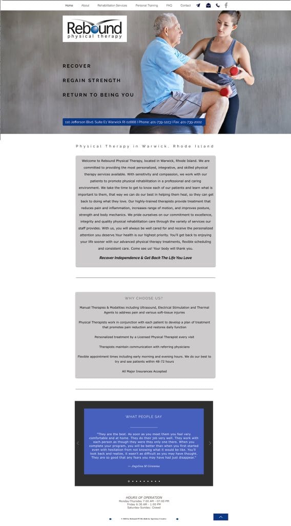
Rebound’s old site was a study in missed opportunity. Minimal photography, dense blocks of text, and a layout that felt cold and clinical were the exact opposite of the warm, personal experience their patients raved about. For a practice competing against large corporate PT chains, their greatest competitive advantage — those human relationships — was completely invisible online. A prospective patient landing on their site had no way of knowing what made Rebound special.
The site also lacked clear navigation and wasn’t optimized for mobile or search, meaning people in the Warwick area looking for physical therapy weren’t finding them the way they should have been.
The Solution
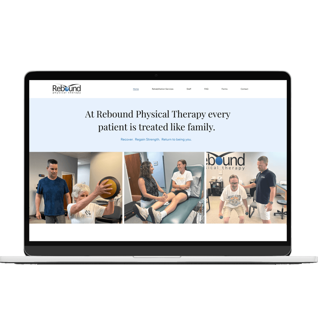
I began with strategy before touching a single visual. Working closely with Melissa and Joe, we refined the language across the entire site, moving away from generic clinical descriptions toward copy that genuinely reflected their approach: personalized, attentive, and rooted in real relationships. The headline “At Rebound Physical Therapy, every patient is treated like family” is the core truth of their business.
From there the visual decisions followed naturally. Real photography of therapists working one-on-one with patients became the centerpiece of the homepage, showing prospective patients exactly what an appointment at Rebound feels like before they ever walk through the door. Warm, human, and professional.
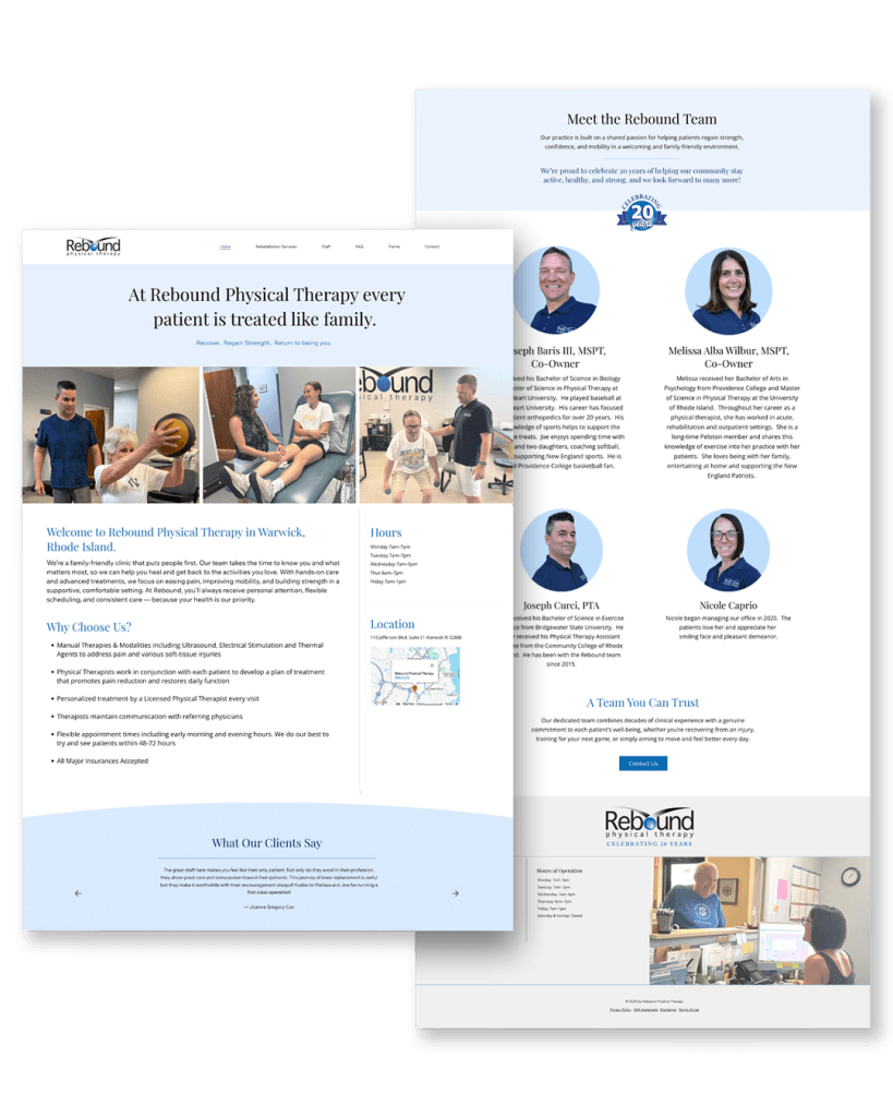
The redesign also addressed several functional gaps. Their rich patient testimonials, some of the most genuine reviews I’ve encountered, were elevated and woven throughout the site rather than buried. The navigation was clarified and streamlined, making it easy for patients to find services, meet the staff, access forms, and get in touch. The site was rebuilt to be fully responsive across all screen sizes, and foundational SEO was applied so that people searching for physical therapy in Warwick, Rhode Island can actually find them.
The Result
Rebound Physical Therapy now has a website that does what a good website should: it tells the truth about who they are, immediately and visually. The warmth that patients describe in their reviews is now the first thing a visitor experiences. Twenty years of relationship-building is finally visible.
For a small independent practice competing in a market increasingly dominated by corporate chains, that’s not a small thing.